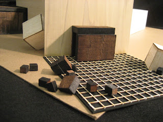
My interpretation of a contemporary spiritual space involves massive objects, heavy forms that are simple yet inviting, which is why I began my design process with squares. Upon experimenting with layering, shifting and joining, I developed a deep appreciation for a variety in levels which convinced me that even if I decided not to stick with squares I knew heirarchy in height was going to be an important aspect of my design.

Upon accepting the fact that squares are rather limiting in terms of program I moved on to hexagons which really provided me with a lot more options.
In an attempt to really make my design memorable and moving I spent countless hours scouring through thousands of examples of churches for inspiration. It was my stubborn indecisiveness that really prolonged this process and resulted in another hundred hours or so of brain storming and sketching. Obsessed with the physical, I found

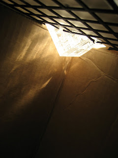
myself investing entirely too much time on the aesthetics and really disregarding the experience once inside the chapel. Once again refocusing my approach, I started thinking about ways to really make my internal experience powerful. Drawing inspiration from Alvar Alto’s Vouksenniska Church in Imatra,Carlos Scarpa's Castelvecchio, as well as Tadao Ando’s Church of the Light I really became fascinated with the illumination of space.

What most attracted me were floating walls that would allow light to pour in from the sides and really scatter across the entire interior. In addition to this lighting scheme, I also fell in love with Ricardo Legoretta’s work of alternating slices of light. I felt that this theme would work well in my transitional spaces, serving as a directional guide encouraging a forward motion towards the main chapel. The tall repeating bars of light also served as a nice contrast

to the more massive main chapel exterior, providing a skeletal element to balance out the design.

My Lighting:


As for the circulation, I strongly felt that in

order to give my chapel a profound spiritual feel it needed a long and defining linear procession, one that would make the journey to the altar that much more meaningful. After dwelling on this idea for a couple days I realized that I was so consumed in this concept that I was completely neglecting significantly more important aspects of spirituality. What I find extremely important about religion is the right to choose which ever path you desire. With that said I, I reconsidered my approach and sought to implement an element of free will to my chapel experience. With the main chapel as the most important component, I really wanted

a plethora of pathways to the chapel that would really reflect this freedom of choice. After entering through the lobby, one would encounter a decision of taking the more direct route to the chapel or to travel down a meditative space that is really open and ideal for reflecting before entering the main spiritual room. In addition to those two pathways, one could also go up the stairs to the second floor which leads directly to the balcony overlooking the altar. This elevated space I designated as my zen view and in order to give it that much more significance I provided a clear view to the ocean directly ahead. The balcony would be the only place to really enjoy the scenery and the expressive lighting going on inside of

the main chapel which would make this private space the highlight of the edifice. The final route to the main chapel would be a passage around the exterior of the building guided by the fountain river which would lead you to the side chapel and direct access to the main chapel.


After finalizing my design for both the chapel and offices, I came to the realization that there was a rather annoying void in between both of my structures, a barren space with a lot of potential to really bring the two entities together and create a greater sense of community. A simple courtyard would not suffice so I opted to infuse a river fountain that would meander through the void and carve out paths that circulated the main chapel. The fountain provided a greater sense of peace and was ideal for the courtyard

Process:


 I had a few major themes and ideas starting this project: the ocean, the sky, symmetry, triangular forms and hierarchy through height. I wanted the architecture and major forms of the building to bring a sense of sacredness to create a sanctuary. I felt that triangular forms were exotic, but if used correctly could be simple and astounding. This combination could create a wonderful experience, which I strived for in my design. I felt that the irregularity of the forms could be controlled if symmetry was incorporated.


